I see you there, every IGN reviewer in existence, reaching for your collective keyboard, ready to haul out the phrase “a charming, retro aesthetic” to describe the latest indie game.
Don’t do it. Please. Don’t. Just stop. Stop it.
Alternatively, keep going—and while we’re at it, why not call Hollow Knight “themed like an early Disney princess movie?” Hollow Knight’s animations are drawn by hand, and the original Disney movies were, too. And now that I’m thinking about it, Dark Souls is really just Miyazaki’s homage to that scene in Jurassic Park when the kid navigates through the file system—the fact that they’re both 3D visualizations is especially telling.
Retro means positive throwback. In 2021, that means the primitive graphics and gameplay of the eighties and nineties, or the blocky models and rigid yet expressive gamefeel from the N64, PS1/PS2, and early PC eras which are showing up a lot in indie shooters. Retro means nostalgia.
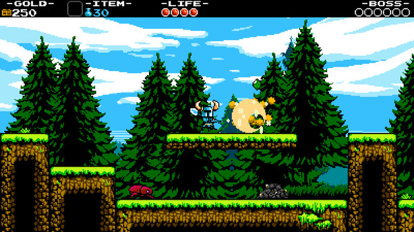
 Shovel Knight actually does have a charming, retro aesthetic
Pixel art means pixel art. It’s digital art distinguished by how much control the artist has over individual pixels. Good pixel art takes care, dedication, and a specialized type of artistic vision. Pixel artists spend thousands of hours on their craft, and the results can be breathtaking.
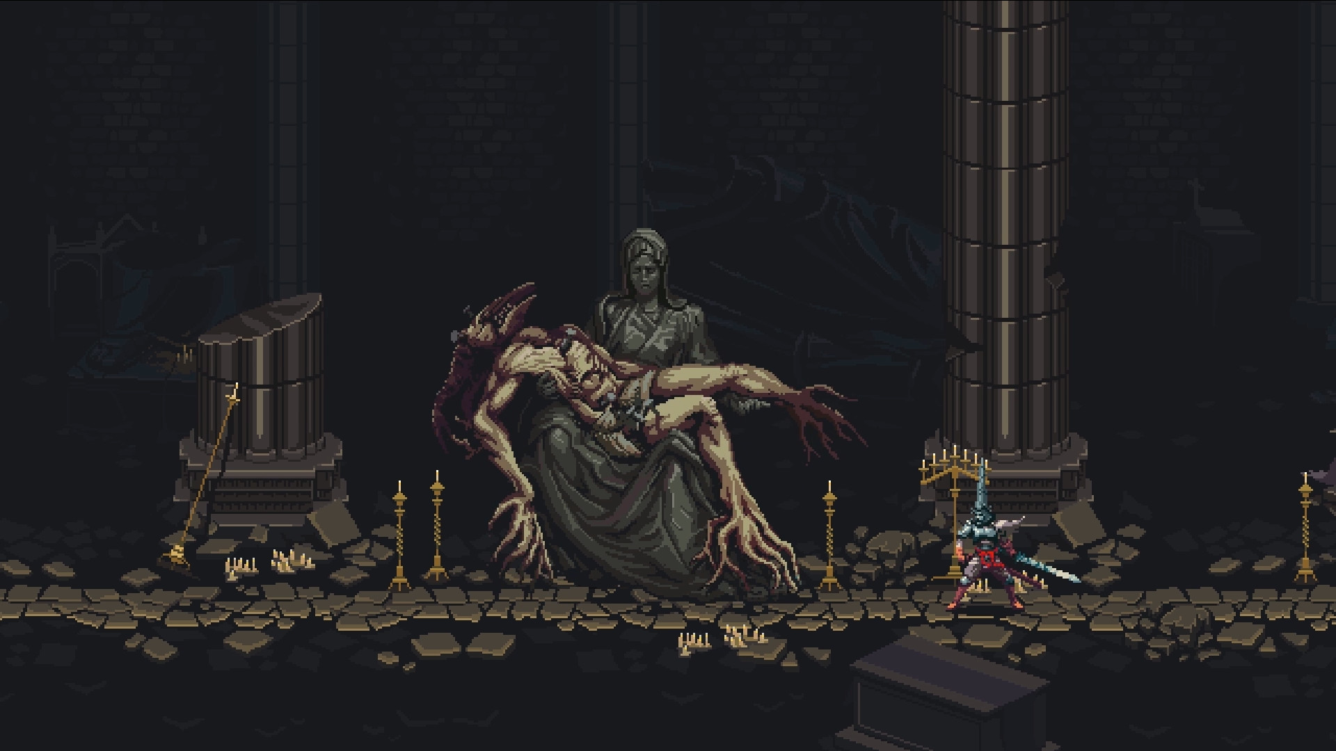
Nothing in Blasphemous reminds me of, say, 1987’s Kid Icarus, even though they’re both platformers and both pixelated. Blasphemous doesn’t remind me of Super Mario Bros., either, or Bubble Bobble, or any number of other old games sharing a couple of features. Blasphemous is a quality game because of its gameplay, level design, and presentation, not because it elicits nostalgia. Nostalgia-inducing games can be quality games, too, but Blasphemous isn’t one of them.
 Honestly, this is really giving me Baby Jo in “Going Home” vibes
Blasphemous’s art style is intricate but readable. It’s got a terrific gamut of colors, tiny pixels, and massive (by pixel art standards) sprites, meticulously animated. It’s got high-fidelity music and audio and a very large, multilayered world. It would’ve been impossible to create a game like Blasphemous on 1980s hardware.
Pixel artists who aren’t going for a retro look can get a ton of mileage out of their format’s limitations. Blasphemous’s art style works so well in part because of the inherent lack of detail in low-resolution art: the art style continually feels like it’s bumping up against the upper boundary of its medium, forcing more detail into each screen than can fit. Our brains naturally fill the boundaries between pixels, and the end visual effect is one of ornately decayed, filligreed decadence that’d be much more difficult to pull off in a style less…well, stylized.
I don’t expect complaining about terms like this will affect the bigger industry. Still, I feel for the brilliant artists whose work has been diminished, intentionally or not, for their chosen format. Every time we slap retro on a project for its use of pixel art, we downplay not only the artistic intention of the project’s creators but also our own critical vocabularies. “Why’s Blasphemous pixelated?” we might ask—“Because retro,” comes the reply, saving us from having to address the why behind the fact that Blasphemous’s artists deemed it individually, minutely important to place every single pixel of blood, brutality, and corruption in the game’s rotting world.
That’s what pixel art—good pixel art—communicates: intentionality, detail, and care. And if we’re going to be intentional, detailed, careful critics, we need to address the whole of a piece of art.